Designing for childhood without compromising security
Why a joyful, modern user experience can actually strengthen privacy and safety in early-childhood communication apps — and how Kiddoz combines playful design with enterprise-grade security and full GDPR compliance.
In early-childhood education, digital tools often force schools into a strange and unnecessary compromise. On one side sit the “serious” applications—stiff dashboards with grim interfaces that promise safety through their corporate demeanor. On the other side sit the friendlier, more modern tools that families enjoy using, but which raise doubts about how well they protect children’s data.
Somehow, the industry convinced itself that you cannot have both joy and security.
At Kiddoz, we never accepted that premise.
From day one, our goal has been to build a teacher–parent communication platform that feels warm, calm, and human—while also standing firmly on top of a privacy architecture engineered for the realities of early-childhood education. We believe communication about children should feel beautiful and intuitive. And we believe it should also be rigorously safe.
These two ideas are not in conflict. In fact, one strengthens the other.
Rethinking what “secure” looks like
Traditional school software tends to mirror the visual language of banks and government systems. Heavy blues, hard borders, cluttered menus—an aesthetic that signals “official” more than “thoughtful.” This seriousness is often interpreted as security. But security is not a color palette. It’s not a mood. It’s not a sense of heaviness in the UI.
Privacy-by-design security architecture comes from the decisions no parent can see at first glance: encrypted storage, strict access controls, GDPR-conscious infrastructure, and simple flows that prevent accidental missteps. None of this has anything to do with whether the screen looks playful or stern.
For Kiddoz, choosing a warm palette of emerald, cream, and soft purple wasn’t a gamble—it was an acknowledgement of what early-childhood spaces actually feel like. These are places filled with curiosity, artwork, conversation, laughter, emotion, and motion. Why should the digital tools that support them feel bureaucratic or cold?
The truth is that a friendly interface, if anything, reduces cognitive strain. And reduced cognitive strain leads directly to safer behavior.
When joyfulness becomes a security advantage
People rarely talk about this, but the greatest vulnerability in most systems is not the infrastructure—it’s the humans using it. Teachers juggling a dozen responsibilities are far more likely to make mistakes inside a cluttered or confusing interface. Parents navigating maze-like menus are more likely to give up and move their conversations to channels that offer convenience but zero protection.
By contrast, a well-organized, inviting interface gently guides people toward correct behavior. It reduces errors not through instruction manuals, but through clarity. The less time teachers spend deciphering where to tap, the more confidently they can manage who sees what. The calmer the environment, the easier it becomes for parents to stay within the protected ecosystem rather than resorting to unencrypted alternatives.
In this way, joyfulness is not ornamental—it becomes a subtle form of risk reduction. The design helps the security succeed.
The burden of “serious UX” in education
Many of the tools used in schools today were designed for administrators rather than for the people who actually interact with children every day. The result is software that feels like work even before you begin working. Teachers feel overwhelmed by interfaces that resemble accounting systems. Parents feel disconnected when the space meant to show their child’s day feels sterile.
And children—the heart of the entire ecosystem—are reduced to data points in a UI that speaks the language of bureaucracy rather than the language of early childhood.
We think the industry got this backwards. Safety shouldn’t demand that software abandons warmth or empathy. Quite the opposite: when tools reflect the emotional reality of the environment they serve, they enable safer, more conscious use.
Learn more about Kiddoz for Schools to understand how we approach this shift.
Joy on the surface, steel underneath
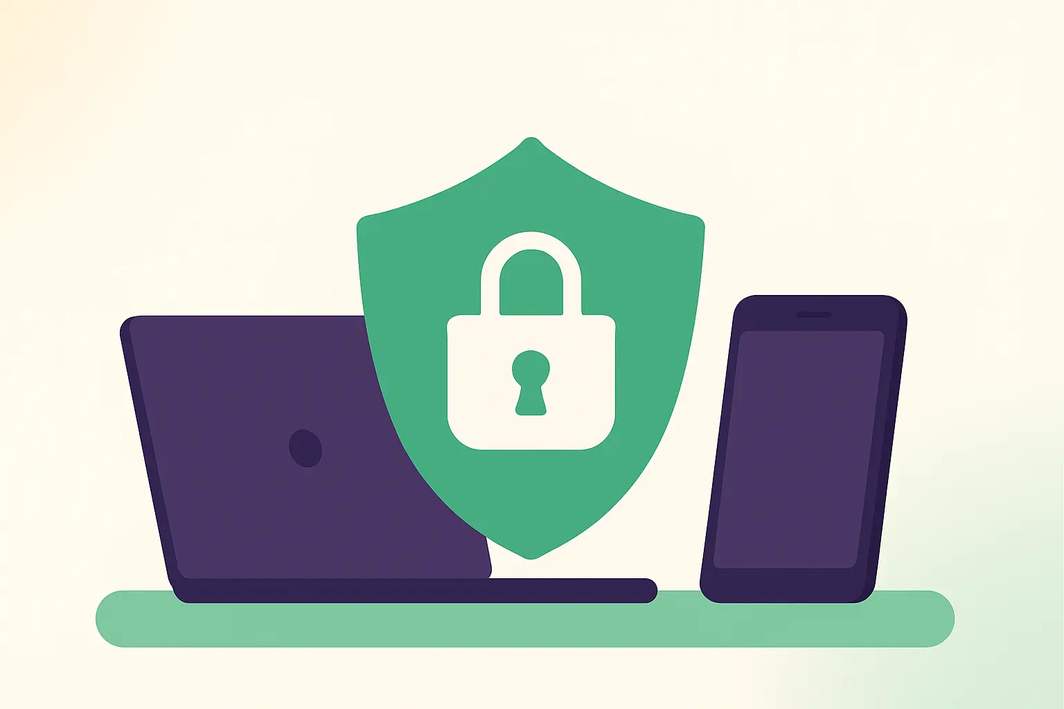
Kiddoz embraces this duality fully. While the UI is gentle and welcoming, the systems beneath it are unshakeably serious. Every photo upload, every permission check, every moment shared flows through infrastructure built to protect families and to give schools confidence in their compliance posture.
End-to-end encrypted storage, strict role-based access, EU-hosted infrastructure, and a total absence of advertising or data resale aren’t “features” to us—they are foundational obligations. Kiddoz was built for environments where privacy is not optional, and where the users entrust us with the most sensitive and treasured material imaginable: the daily experiences of young children.
We often say internally that Kiddoz is a secure vault dressed in a friendly sweater. The strength is structural. The softness is intentional.
If you’d like to explore the details behind this, visit our page on GDPR compliance for early-childhood centres.
Security should feel natural, not performed
There is a performative style of “security UI” that many platforms adopt—warning labels everywhere, intimidating settings pages, color schemes chosen to make the product feel weighty and official. But families do not build trust through intimidation. They build trust through consistency, clarity, and stability.
Security that inserts itself loudly into every step rarely ends up helping anyone. Instead, it makes tasks feel heavier, slows people down, and leads some to bypass the system entirely.
Kiddoz chooses another path. Our approach is to make security feel so natural and so quietly reliable that it fades into the background. The app should not remind you of its security posture every second; it should simply behave in a way that makes security the default outcome, even when people are tired, busy, or distracted.
Teachers can see this clearly in the tools designed for teachers. Parents feel it through the product’s parent communication features. Both groups experience security not as a barrier—but as a quiet constant.
The future of human-centered EdTech
The EdTech world is entering a new era. Tools for young learners no longer have to resemble enterprise dashboards to be taken seriously. The next generation of software will be defined by two equally important forces: emotional intelligence in design, and rigorous infrastructure beneath it.
Kiddoz belongs to this shift. We see a future where the tools teachers use reflect the classrooms they lead—creative, warm, structured, and alive. We see a future where parents feel connected without feeling watched. And we see a future where privacy is not something schools must struggle to maintain, but something woven naturally into every action the product allows.
Read more about how Kiddoz works to understand how this philosophy becomes real in everyday use.
A final thought
Childhood is joyful. Security is serious. Technology should honor both.
Kiddoz exists to show that the safest place for a child’s digital memories can also be the most beautiful, the most intuitive, and the most human-centered. Security earns trust, but design is what keeps it—and what keeps people coming back.
We’re proud to build a product that proves you never have to choose between joy and safety. You can have both. And in early childhood education, you should.